This is the forex analysis I do on every currency pair I trade, and this is exactly how I make profit each time.
If you have ever been fooled by a sudden movement of the price action, this is the video for you.
During the recording, there was a spike, but due to multiple timeframe analysis, I was able to deal with it accordingly.
Watch the Video
Gold Monthly Chart Analysis
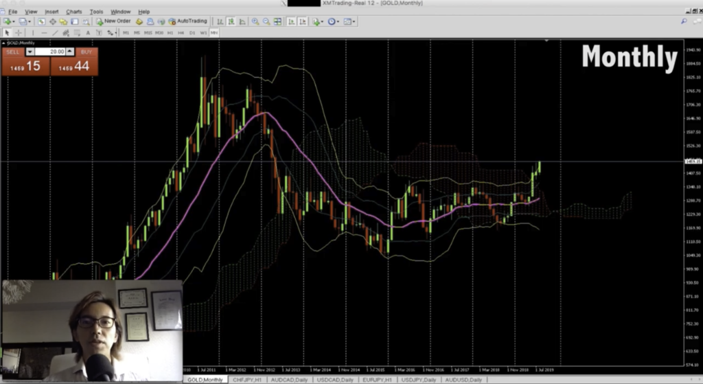
This is the Gold chart on the 5th of August, 2019 and let’s start from Monthly chart.
One thing you need to remember is whenever you try to analyze the chart, always, you know, always start from a big picture and break it down. You know, if you just start your analysis from like 1min or 5min chart, it’s hard because your initial focus becomes too narrow, and it becomes too hard to grasp a big picture. So always have a bird’s eye first and overlook the city, then you break it down to the details of the structures.
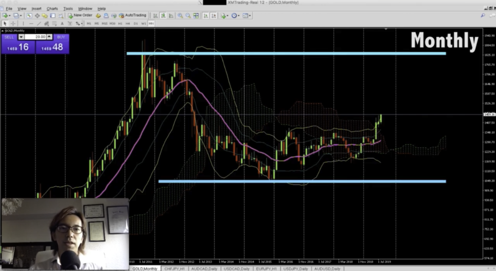
So this is a Monthly chart and if you look at this, first thing I notice is the current price in this Monthly chart is right within the range. If you draw lines on the recent lowest and recent highest, it’s right in the middle of the two lines.
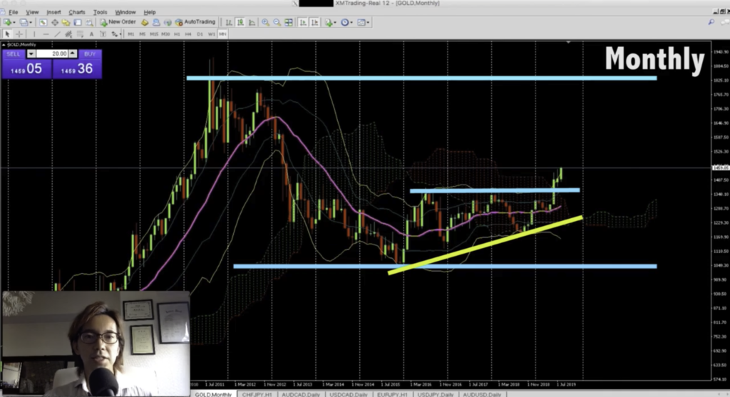
Then what I notice next is that you can see recent lower high here, and the price just broke the recent highest marked twice right here, and it just started the bull trend within the whole big range.
Also, if you look at the technical indicators, the price just broke Ichimoku cloud upwards and it’s on the Bollinger Band’s Deviation 2 and it’s going up. So after the price broke this line upwards and because it’s on the Deviation 2 of Bollinger Bands, that means the price could extend further upwards, because there’s no significant barriers up to the recent highest up to this level, you know, I call this movement “band walk,” because the price walks along the Bollinger Bands between Std Div 1 and 2 and it keeps on going upwards when the trend is strong.
So as far as I see this monthly chart, I would say it’s reasonable to place buy. but we don’t buy yet. Remember, this is just a bird’s eye. Alright, let’s break it down to weekly chart next and see what we can find.
Gold Weekly Chart Analysis
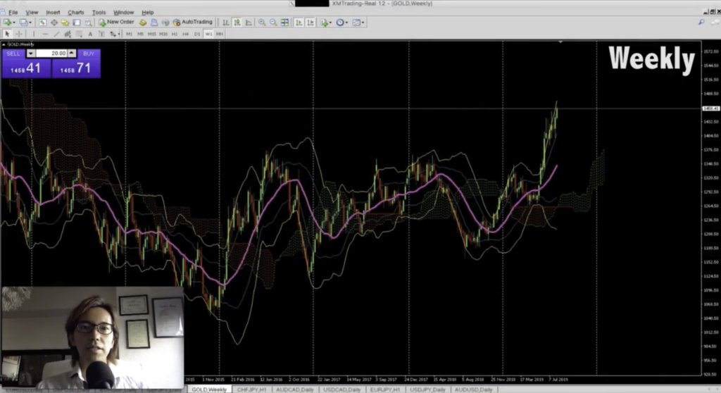
This is the weekly chart on Gold and as we saw on the monthly chart earlier, you can see there’s lower high set up here, and after the price broke this resistance line upwards, the price just keeps going up. In this weekly chart, too, the price has been “band-walking” along this Deviation 2 of Bollinger bands, and also the price has broke Ichimoku clouds upwards, so there’s no doubt that the price continues to go up.
So in monthly chart, it’s buy, and in this Weekly chart, too, it’s also a buy.
Gold Daily Chart Analysis
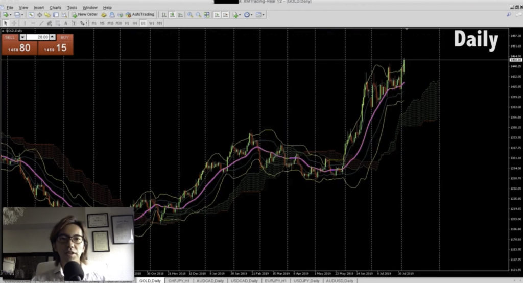
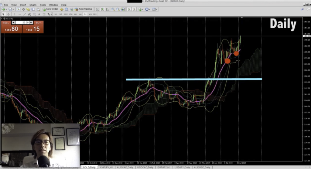
Ok, here is the Daily chart. As we saw on Monthly and Weekly chart, after the price broke this line right here upwards, on this Daily chart, too, you can see it’s been on a bull trend.
The price has been above Ichimoku cloud, and as you can also see that the price was supported couple of times on this 20MA, this pink line, and the price keeps on going upwards. That means when the price comes back down, it might be supported
by this 20MA and keeps going upwards.
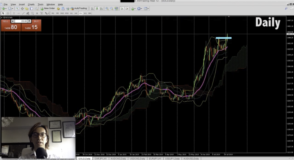
And if you look closer, it looks like the price just broke the recent highest, and it’s above Bollinger Band’s deviation 2, meaning the bull trend is still quite strong. So that determines which direction I will be trading, and of course, it’s buy.
Gold H1 Chart Analysis

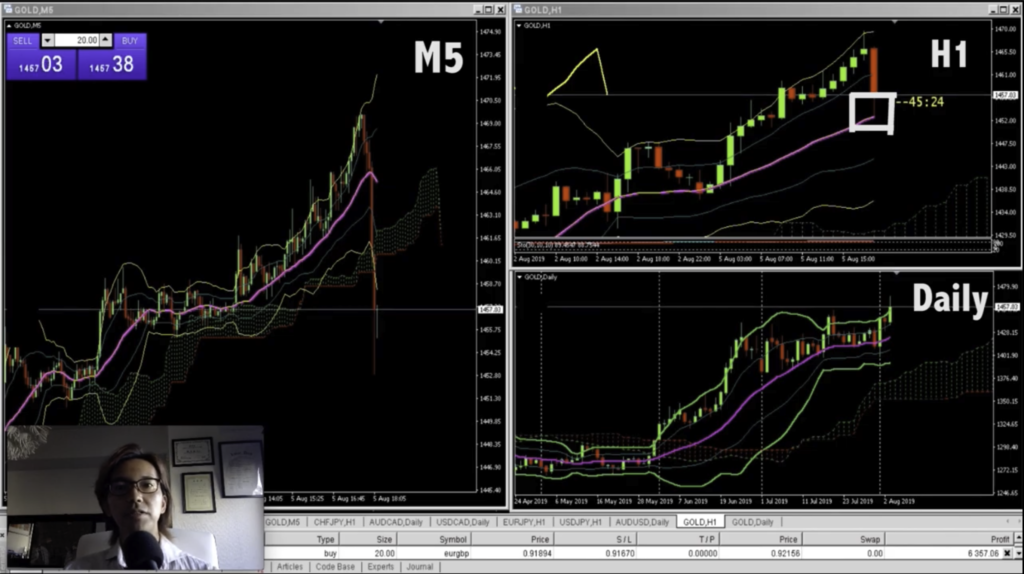
Next, we will be seeing H1 time frame, and try to see more precise spot for placing buy with low risk, and high return. Alright, here is the H1 chart as of the 5th of August, 2019.
First thing I notice is that the price broke the recent highest upwards here. And in this H1 chart, too, the price is above the Ichimoku cloud and it keeps going up between standard deviation of 1 and 2 of the Bollinger Bands, so it shows it’s on a strong bull momentum. Also, I can see that the price is supported by this 20MA, the pink line, so even the price goes back down, it might be supported by this MA and it keeps going up. So this is what I mean by having a bird’s eye view, because if you just look at this H1 chart and think it’s buy, you know, there might be a strong resistance line in weekly or monthly, or daily time frame somewhere like here, or maybe in Daily chart, it might show that the current price level is right in the middle of the range and right inside of Ichimoku Cloud, you know, that means the price could go either direction.
So if that’s the case, even if it looks like a strong bull trend on H1 chart like this, the price could suddenly spike down and you don’t know the reason why just by looking at this H1 time frame. That’s why whenever I trade in any currency pairs, I look at multiple time frame charts to get my confidence on where exactly the current price is at. I know it takes time to look at a chart like this, but once you master it, you will never be confused of the price action in 1 single time frame, and your trade will be much better.
How to train yourself to have multiple view analysis
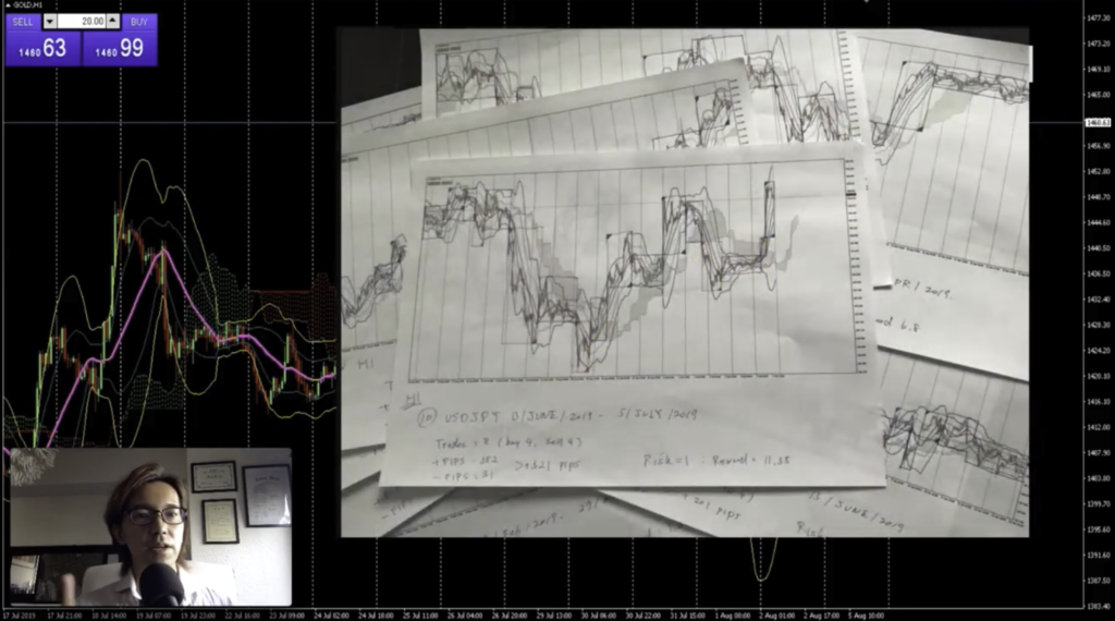
One of the ways you can train yourself to have a bird’s eye view is you print Monthly, Weekly, Daily chart on 1 specific currency pair, and you align them, and look over those charts. That way, you will have different view on each time frame, and it really helps you to integrate to understand how the market moves with different time frame. Alright, coming back to the chart, speaking of the target, the ultimate target would be the recent highest on Monthly chart as you saw earlier, but it depends on the future price actions. And speaking of stop loss, the reasonable stop loss would be down here, below the recent lowest, but if I put the stop like this place, the risk is too big, right? So in this case, I will break it down to M5 chart and see where the reasonable stop loss can be placed.
Gold M5 Chart analysis
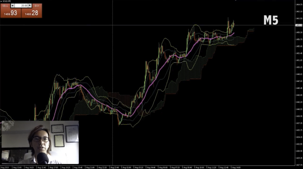
Alright, here is the M5 chart. As you can see, on this M5 chart, too, the Gold market has been on a beautiful bull trend.
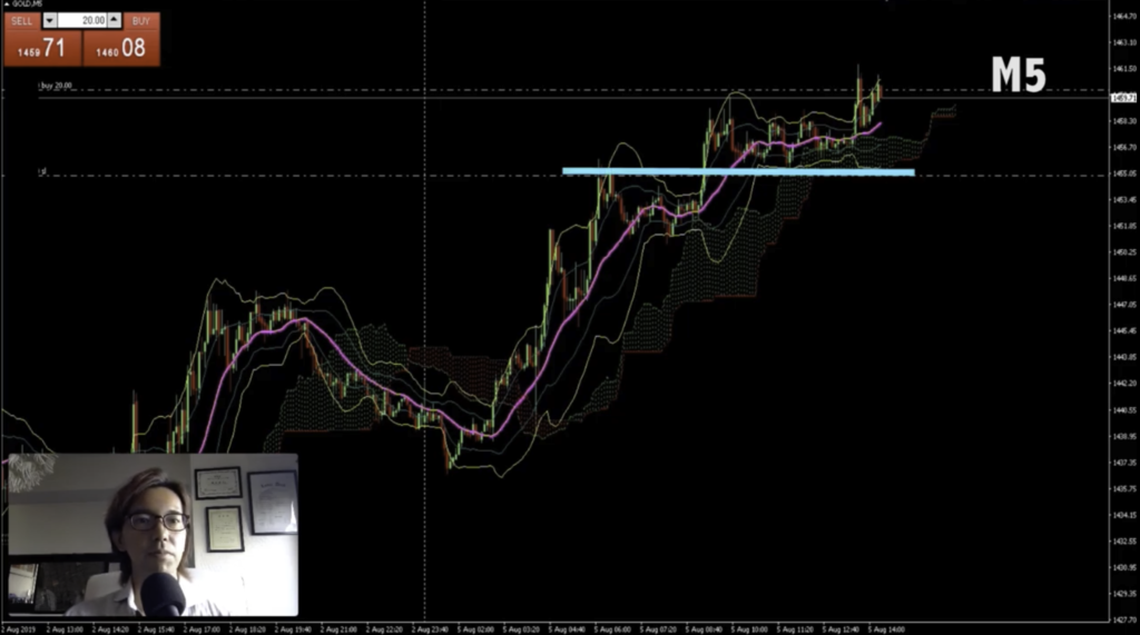
And regards to the stop loss, you see there’s a support line here right? which we could not see in H1 time frame. So let me place buy here, hold on.. and I put stop loss right here, below the recent lowest, about 52.8 pips below the current price.
Remember, in H1 chart, the stop loss was too far and the risk was too big, but in this M5 chart, you can clearly see where the stop loss should be and it’s closer as you can see that the price was supported on this level. So right now, the stop loss is like 53 pips, but it doesn’t mean I will be holding the position until it hits it. As of now, I am thinking to cut loss when the price goes below this MA, the pink line, or below the cloud.
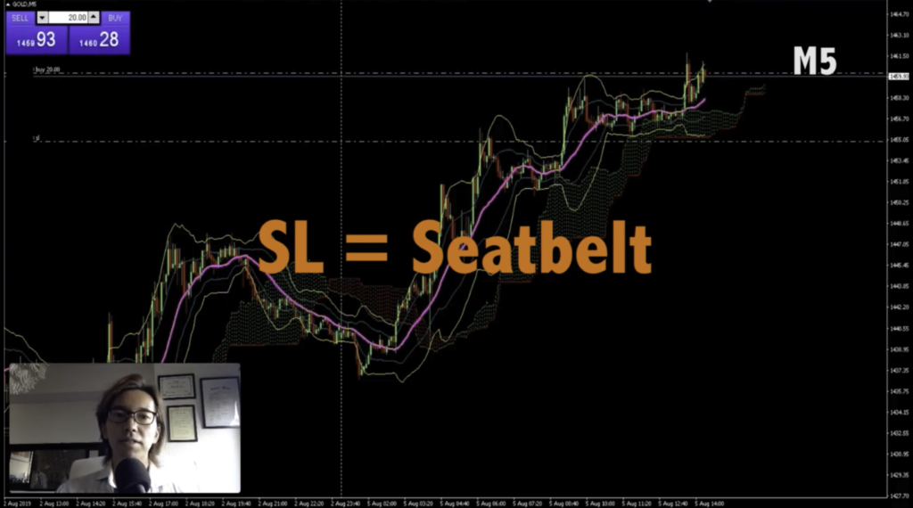
But the reason why I place the stop loss is because it’s like a seatbelt, like when I cannot watch the market or when I am at the bathroom, the price could spike suddenly, right?, and I have a big loss. So to prevent from the loss by spikes that can happen anytime, I always make sure to place stop loss. As I talked on the previous video, it’s like a seatbelt that can save my life when accident happens.
4 Hours Later..
About 4 hours have passed from the previous recording.
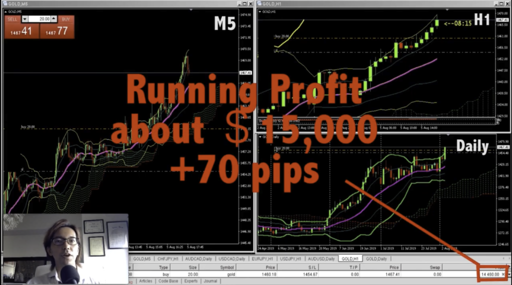
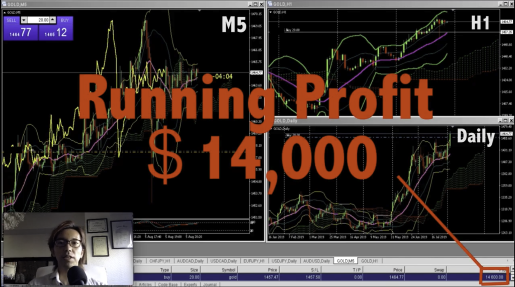
On the screen, I am showing Daily chart, and H1 chart, this is M5 chart. Now, I have running profit of about $15,000, about 70 pips of profit from where I placed buy.
If you look at this M5 chart, the price has been bullish above MA20 right? The pink line. It’s been supported by this MA20 like a couple of times here, so my initial target would be until the price breaks MA20 downwards because that’s one of the signals when the momentum changes. But as long as the price touches MA20 and confirm it’s been supported and it keeps going up, I will keep holding the position.
Also, if you look at this H1 chart, you can also see the price has been on bullish momentum as it moves between Bollinger Band’s deviation 1 and 2, right? So we can also say that as long as the price moves upwards between these deviations, I will keep extending the profit. Alright, I will let the time go by and see how it’s gonna turn out.
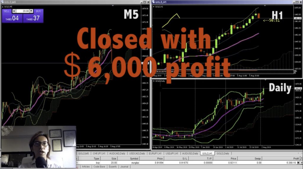
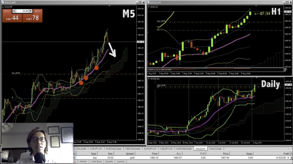
Hi, I just started to record a video again as the price just started to go down. So let me take profit first and explain later.. hold on. alright, it ended up with like $6,000 of profit.
You know, I was a little away from the screen and look how fast it’s going down now. Like I said earlier, I was thinking to take profit when the price touches on this moving average, but oh well, it’s ok, as long as I don’t lose the game.
And looks like the price keeps going down and it’s strong. Wow,, it’s pretty strong… but my view is still on buy, there’s no reason to sell at this moment, like when there’s a W bottom or triple bottom down here in this M5 chart like this, or when there’s a pin bar appears like this, then I might be buying again. Anyways, I will just let the time go by until there’s any significant price action confirmed.
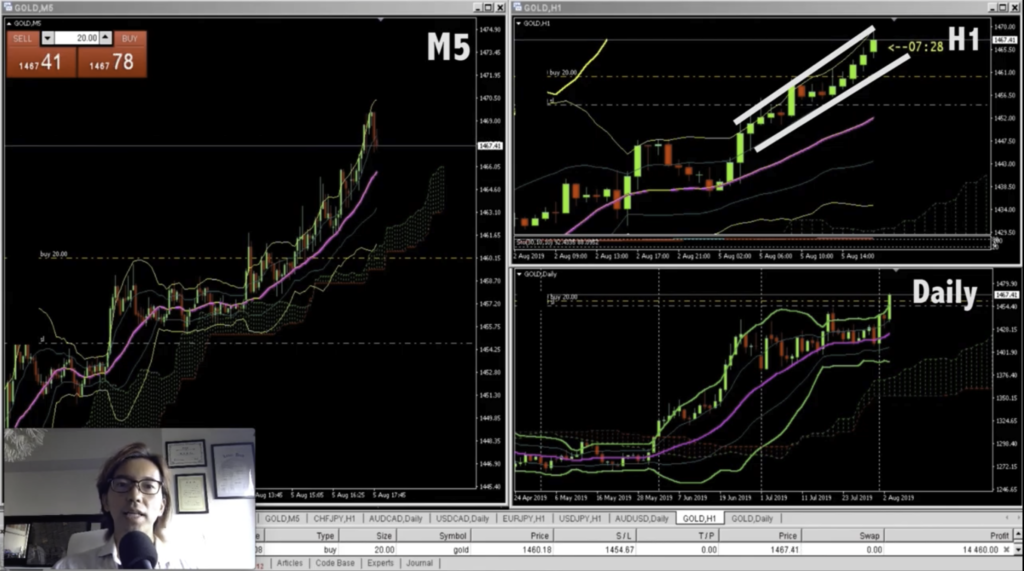
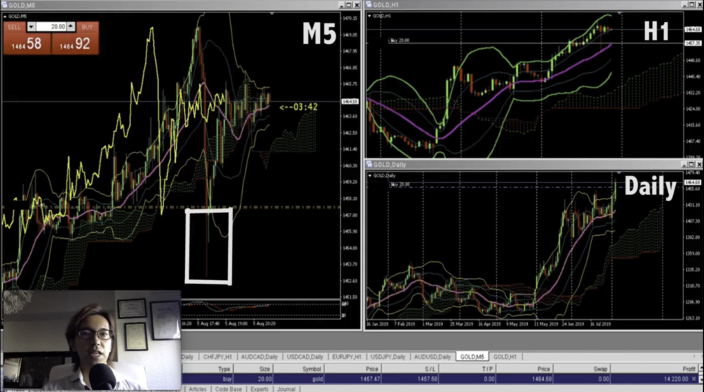
Hello again and after a while, look at the H1 chart and see how the price was supported beautifully on the moving average. And, if you just look at M5 chart, I think this is the best timing to buy again… so hold on, let me place it. And place the stop loss right below the recent lowest.
Alright, let me explain why I bought it again. If you look at the Daily chart first of all, the market it still on bull trend, right?
And in H1 chart, it shows it came down but wick pointing downwards, and it’s been pushing right back after it’s been supported by this MA20. Also, if you look at the M5 chart, you can also see that the price was supported on this line, and there’s a long wick pointing downwards. so I am pretty positive to place buy in this case again. But if the price starts to go down again, then I will just cut loss again. But for now, I just placed buy and see how it’s gonna turn out.
1 Hour Later…
About 1 hour have passed from the previous recording.
The price has been going up and I have currently running profit of $14,000 now. And I already moved the stop loss slightly above the position so that it becomes either win or break even game.
You know, if you only look at M5 chart and if you see the price spiked down here, usually people got scared and froze and do nothing, or maybe some people just jump in and place sell as soon as they see it’s spiking down, and get their loss cut, you know, I’ve seen so many trades like that.
But if you have multiple timeframe set up, one thing that’s important is that you can wait. You can wait and look around how things are. In this case, you will exactly know it’s perfectly supported by this moving average in H1 chart, and in M5, the wick is pointing downwards. So you have better confidence that the price is still wanting to go up.
Multiple Timeframe Analysis is good for 2 reasons
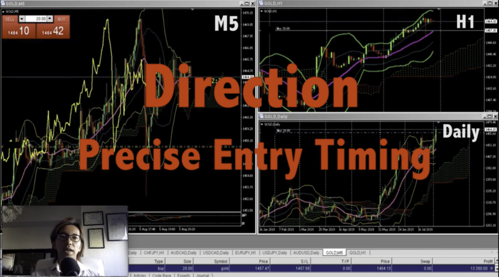
So this is basically how I trade every time in any currency pairs. I use multiple time frame to see the chart direction, whether if I should place buy or sell, or wait. Then as I break down the time frame, I try to see where the most precise entry timing can be. And when I find it on M5 chart or M15 chart, then I just place the position accordingly, or I wait until the right timing comes, so that I have the best risk reward ratio in every trade I do.
You know, to be honest, this type of analysis takes time at first because you will have to see all the time frame on 1 currency pair, and after all the analysis, if you find it’s not a good timing to trade, you just decide to wait. Then you will have to open another chart and do the same thing all over again. I’m already used to doing this so it doesn’t take more than 10 min on each currency pair, but why I recommend this type of analysis is because you will not gonna be fooled by the price action of just 1 timeframe. So if you have been trading with just 1 single time frame, try to see Daily chart, H1 chart, and M5 chart at least, and get used to have multiple view point. That way, you will know which direction you should follow, and trade with better confidence in yourself.
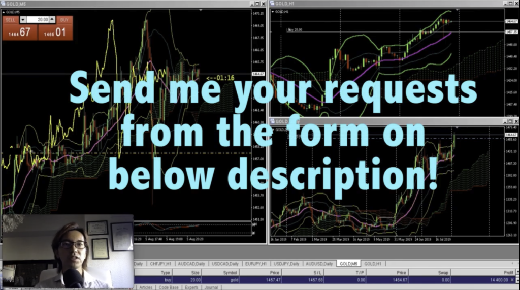
Video Request Form
Thank you, Cheers,